Greenvivir
Financial App Redesign
Project Overview
Finvivir is a Mexican Financial company that gives micro-credits to women in rural and urban areas, but mostly in rural. The company staff have to go to several towns in a day in order to gather all the payments and also try to engage more customers there.
Few years ago they come up with a new app to digitize manual procedures for the staff, but since it was created without research, neither designers, this app had a lot of problems for the end users (company staff) and even some of them prefer not to use it and keep doing it manual.
My Contributions
As a UX Designer, I collaborate with the team to do research, data analysis, ideation, do a Low-Fidelity Prototype, test it and finally come up with a High-Fidelity Prototype with all the knowledge gained.
Deliverables
Discovery Workshop, Journey Maps, Interviews, On-Site Research, Online User Testing, Information Architecture, Prototypes
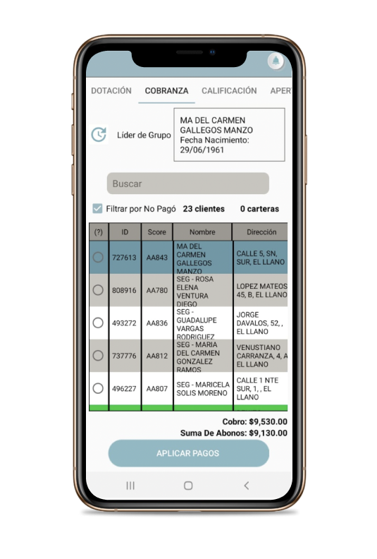
AS IS
The last design of the app was difficult to use for the end users (company staff). With the research, we figured out that they have information there that they don't even use or that they use in other moments.
Also, they had a hard time recording clients' payments on the app, whether they paid, didn't pay, or how much they still owed. So many preferred to write it down in a personal notebook by hand and then enter it into the app later which caused delays and rework.
DISCOVER
PRIMARY
I interviewed the current Staff app users and conducted open-ended interviews, to understand better the pain points they had with the current app, a deep-dive in their experience to understand issues and how they handle that.
Also conducted remote workshops, where participants captured the current experience of the manual process they do, the touch-points, people, tools, and technologies involved. Afterward, the pain points were highlighted in order to prioritize the focus for the ideation phase.
Card Sorting - Usability Testing - Prototype Testing
.png)
Primary Pain Points
-Manually verify the calculation made by the application because they didn't trust it, which caused delays and rework
-When filling out the information for each client, the app didn't generate any inform when uploading it, which didn't make users feel confident that the information was already in the system.
-There were some sections that they didn't use they perceived that information as confusing and saturated.
DEVELOP
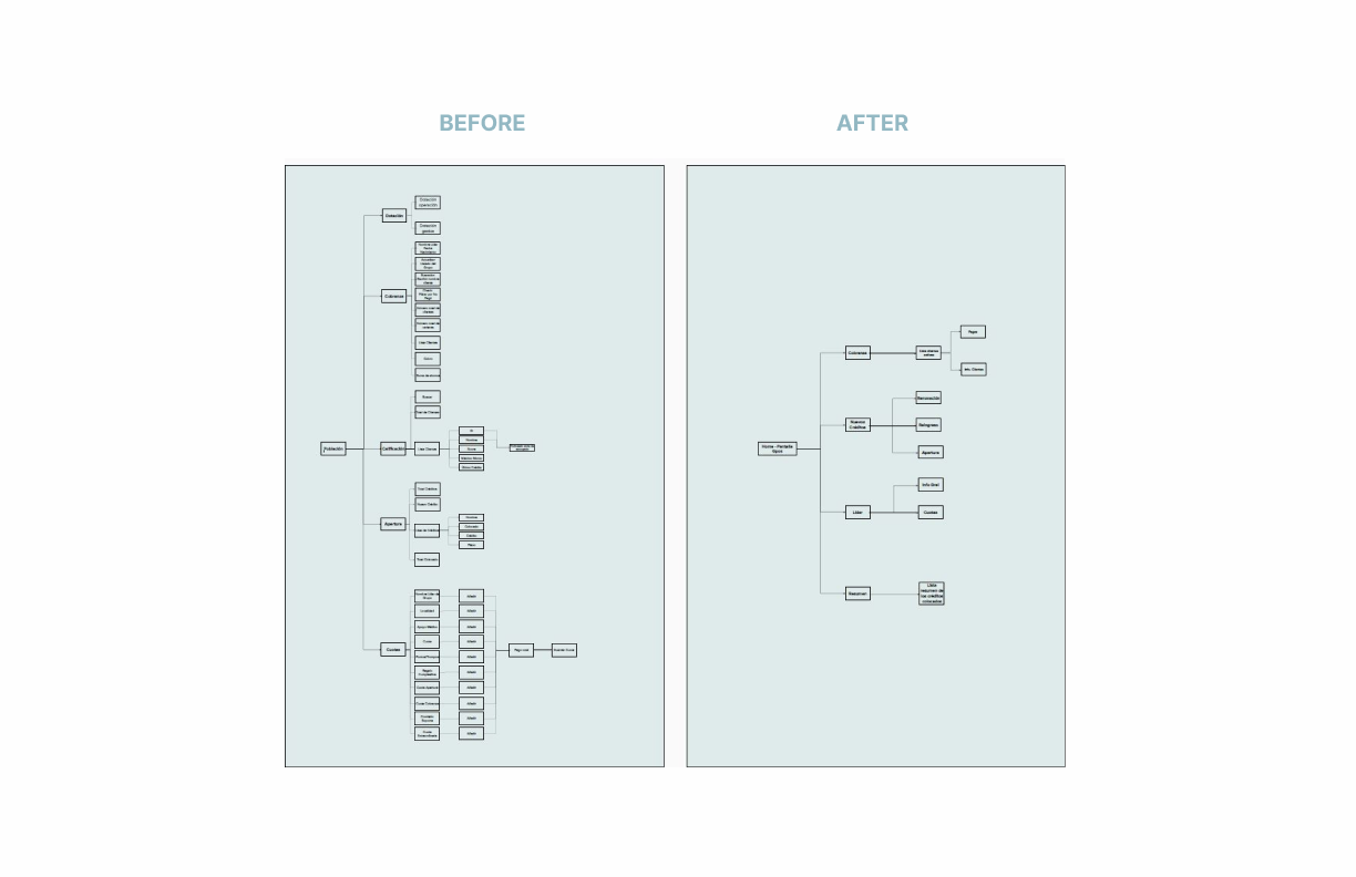
INFORMATION ARCHITECTURE
After the research and mapping all the experience, we came up with three main pain points or opportunities for improvement which eventually were implemented into the design and tested.
So with all the information, we organized and prioritized the content and features included in the app. This included all the valuable and important information on the app to help the user to have a better, seamless and without friction experience, and also for this to help them to complete their main goal which was documenting all the money they collected and delivered en route.
Wireframes
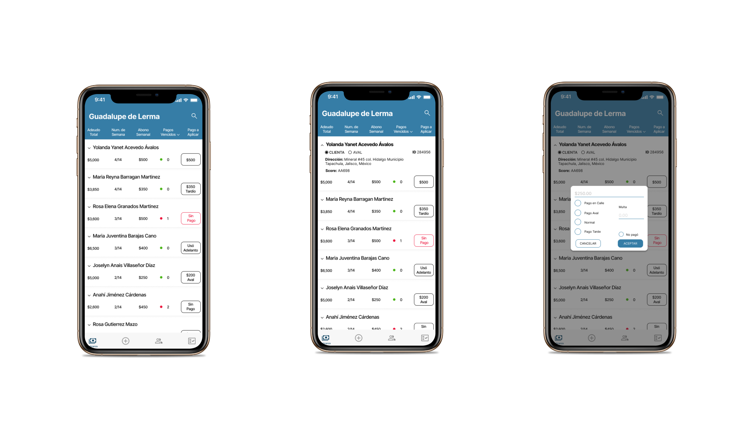
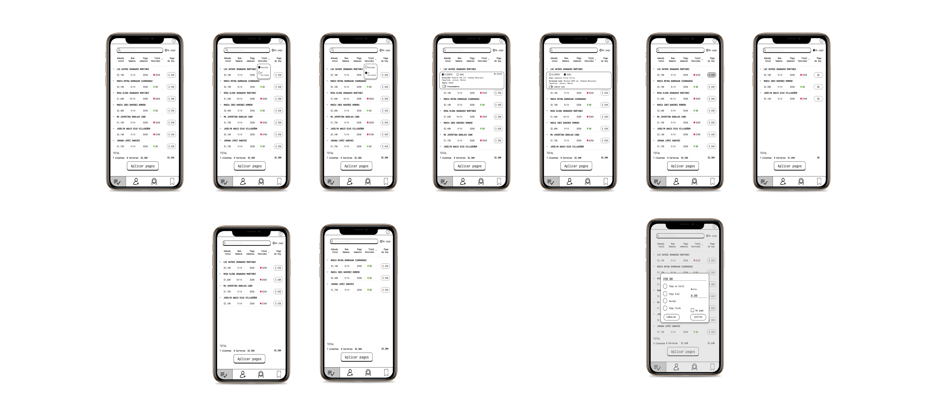
Based on the research, we began to brainstorm and make proposals for possible solutions:
Added tabs so the users could find easily what they were looking for.
Added a filter for one of the most important activities they did: search for customers who have not paid.
Ensure that they can do the calculations in the app with confidence and ease, as well as visually see the necessary information.
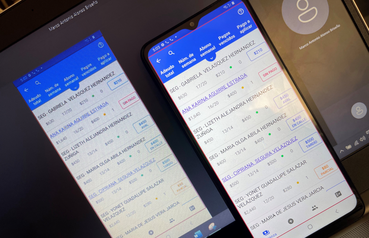
User Testing
For the usability studies, it was necessary to align with the teams for their availability in order to conduct the interviews. Once aligned, the way they could be done was by video call, since it was difficult to gather all the people in one place.